Back in 2005-6 we went schemaless, or sort of schemaless, as we built our toolset for forecasting flights. Now, with a re-build in sight, and triggered by Martin Fowler’s ideas on the pros and cons of schemaless, it is a good time to look back and consider whether we should stick with it.
What?
STATFOR publishes Europe-wide forecasts of air traffic, at a variety of horizons from a month to 20 years ahead. We do this with a toolkit developed in-house in the SAS statistical software. Each forecast involves generating many datasets which can be:
- inputs, such as economic growth, high-speed rail travel times, future airport capacities or statistics on past flights;
- intermediate steps, such as estimates of passenger numbers, or distance calculations; these are ‘intermediate’ in that we may use them for diagnosis, for understanding our forecast, but they are not published;
- and output results, flights per airport pair, flights through a country’s airspace, airspace charges, and others.
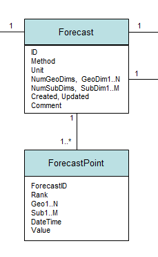
Whether they’re inputs, intermediate or outputs, in our local jargon we call all of these datasets a ‘forecast’, with each observation in a forecast a ‘forecast point’.
All observations, of all forecasts, are stored in a single forecast point table, which has fixed columns: a forecast ID variable; ‘rank’ which refers to a forecast scenario, such as baseline, or high growth; and a datetime stamp. The remaining columns are 'flexible', in the sense that they refer to different dimensions depending on the forecast. They are: the geographical dimensions (for airports, countries, cities); the sub-dimensions (for age group, aircraft type, international or domestic etc); and, finally, the value. So there are multiple attributes which serve as a key, and a single value. We put in 3 geographical columns and 2 sub-dimension columns at the design stage, and it’s been enough. Some forecasts use all 5, some just a single dimension.
So it’s 'schemaless' in the sense that it has flexible columns. The data types are fixed, dimensions always integer, value being real, but the column name doesn’t tell you what is really stored in there, and the value can be a flight count in one row and a percentage growth, distance, time or something else in the next. Here I'm using 'flexible', because the usage doesn't seem to match up exactly with Martin's use of either 'custom' or 'non-uniform'; maybe closer to non-uniform.
To manage this welcoming mess of data, we also have what Martin refers to as an ‘attribute table’ (slide 8), which for us is the ‘forecast’ table. It determines what the columns mean in a particular case, and how many are used of the 3 and 2 that are available. The partial schema ;-) below shows these relationships. The attribute table also gives the units that apply to the value column (flights, index (year x = 100), percentage, etc), and most importantly the ‘method’ which determines what type of forecast this ID refers to in the forecast point table (examples in the bulleted list above).
 (extract)
To give a specific example, the 20-year forecast involves 30 intermediate or output forecasts, as shown below. We keep the inputs separately; there's another 38 of those. The forecasts shown vary from 300 rows to 40 million; from one geo dimension used up to all 5. In fact, we cheat, and 634 is not a geographic dimension even if it's in the geo3 column. The joy of schemaless here is, if it fits, it works.
How?
The main condition, necessary for this to work, is that the key attributes in the forecast point table - rank, geoN, subM, datetime - are each of the same type, regardless of the forecast method, or of what they really represent.
Even to achieve this for something like ‘country’, say, requires some discipline: the raw data have half a dozen different codes and spellings for each country: is that Bosnia-Herzegovina, BOSNIA-HERZEGOVINA, Bosnia-Hercegovina, Bosnia & Herzegovina, BiH, BA or LQ? And they’ve changed over the years, as data suppliers change their minds. We learned the hard way, from a previous implementation that trying to use a 'meaningful' text name is a nightmare, and switched to use a 'business key', an integer not a text name, shortly before we went schemaless.
This goes beyond a ‘factor’ as R would have it, where strings are captured as integers and the values as ‘levels'. It is helped by SAS’s support for user-defined formats. So we have a format ‘FIDTZs', if you want to show or view the integer as a short name, without changing the data, ‘FIDTZl’ for a longer version. (These formats apply to the country, or 'traffic zone' TZ, dimension. Others are defined for other dimensions.)
In addition, we invested in developing the API and the input processes. Every write to, or read from, the forecast table and forecast point table goes through the API. You can even think of each step in the forecast process as ETL ‘extract, transform, load’; each forecast step 'unpacks' one or more (input) 'forecasts' from the forecast point table, using the API, does whatever forecasting is needed at this stage, then packs it back, using the API. But the investment was worth it: we've got a lot of use out of that API over 10 years, and it has needed relatively little maintenance. The modification history has only recently reached 100 items including: some tweaking to improve speed by passing more work to the server from the desktop; and most recently a switch to implement a test and live version of the tables; otherwise mods largely just adding more known dimensions as the code expanded into new forecast areas. Martin says you need a data access layer, and that's certainly worked for us.
And any external data has to get translated from foreign codes into business key as it is loaded. Again, we have a standard approach, working with input data in MS Excel (which is both flexible and allows that mix of numbers and text which means you can document as you go along), then a fixed import process which understands each input type. It's quite a natural way to work, though maybe more prone to copy-paste or fill-down errors than would be ideal.
For code readability, dimensions are always referred to through macro variable names, so &AATAcEisy instead of 634 in the example above, for the aircraft (AC) entry-into-service year (EISY), in the aircraft assignment tool (AAT). Ok, readability of a sort.
Why?
Earlier toolkits used a ‘distributed’ approach, with input, intermediate and final datasets kept in separate tables in a variety of different places in a set of libraries, or folders. This was traditional for SAS at the time, I think. But we learned the hard way that:
- A folder structure doesn't look after itself. Some legacy codes still generates files, see example below. Which of these is attached to a published forecast, so we need to keep it, which was a working file? Who knows? A particular issue once more than one person is collaborating on the forecast. Happily even for these datasets, the important ones are saved in our schemaless system, now.
- Once you've got a forecast, and are trying to work out why it says what is says, 'drilling down' is very time consuming, since each forecast step needs specific handling - since there's no guarantee of consistency of column naming from one step to the next, plus you need to find the right table from each one. With our schemaless version, you just filter the forecast point table for the airport-pair say, that you're interested in, and you can see the trace of how the value was derived.
- Keeping code components independent is hard, since a column name used in a table creates dependencies throughout the code; in schemaless, the column names are all 'vanilla' geo1, geo2 etc, and each component can rename them to something more meaningful if needed.
- Similarly, temporary (within component) datasets are clearly separated from lasting ones, since you need to add a forecast method for anything that you want to last, and load it into the forecast table. Maybe this comes naturally in other languages, but not in SAS macro.
And writing each forecast step is easier. Each one begins with the same few lines to look up the forecast ID of the forecast method you want, in the forecast bundle ('forecast set') for this 7-year forecast say. Then a call to unpack it from the datawarehouse. At the other end, the same few lines to align the final dataset with the vanilla column names, and pack it back up into the datawarehouse.
So it's all perfect?
That this schemaless system works is down to the API, the infrastructure and the users. The bits that don't work are down to the API, the infrastructure and the users.
Using the API takes time: we're writing small, or very large, datasets out of the analysis system into an Oracle datawarehouse. That's an extra read and an extra write step compared to keeping it local. And often an extra delete step, since the previous version of the forecast with method X is deleted before the new one is written: forecast methods are unique in a bundle, by design. This definitely affects performance. Even network latency has been a drag at times in our infrastructure. We've tried to improve the delete process, but there must be better ways of sharing out the storage and processing involved here than when we set out.
The graph shows timings from the main part of the 7-year forecast. On a test of a single run, out of 15 minutes real time, 55% is spent packing up the results through the API. The two longest processes, C211 and C206, each spend more than 50% of their time packing up into our semi-schemaless store. The high cost is clear.
The data we want to store in future is only likely to get larger, if we add more forecast types to our existing ensemble process, or tackle uncertainty more through hypothetical outcome plots than scenarios. So the performance challenge is going to get more difficult.
As Martin says, custom columns cause sparse tables - you can see how sparse in the table above. But I haven't worked out how to evaluate whether sparseness is really part of our performance problem. If the alternative is a single column with embedded structure, maybe that's getting easier to handle (r package purr::transpose anyone?).
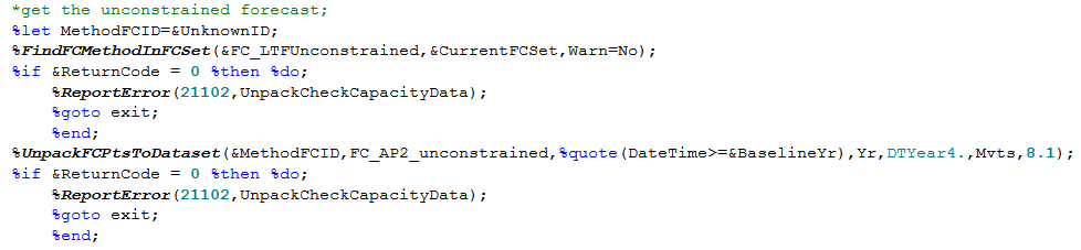
The API invocations are routine, so quick to write, but ugly and long which doesn't do much for readability, or for those times when you're writing scratch code for a quick look at a dataset. See the example below. Why not wrap all this in a single call? Mostly, because of the difficulty of passing the parameters to the %unpack call, since they vary a lot from one instance to the next. In particular the last 4 rename and format the DateTime and Value columns: move from vanilla names to meaningful ones. This would be easier in R, for example. And easier with a bit more metadata: if the system automatically associated the forecast method &FC_LTFUnconstrained with the fact that the right column names are 'Yr', formatted as '2019' etc. Why not do the same for the geo & sub dimension columns at the same time? This would tip the balance from being semi-schemaless to having a sort of 'meta-schema', one layer up from the data structure itself.
You could even exploit the fact that we have a data access layer in place to migrate to a different database structure, where there is one ForecastPoint table for each forecast method. Currently that means moving to 175 different tables, since there are 175 different forecast methods. Doing this at the data end would cut the sparseness problem, but getting the full benefit would involve more code changes (to give the different tables more meaningful column names, for example).
And that ">=BaselineYr" filter? We're still doing it locally rather than in the datawarehouse.
The first cookbook I remember as a kid had a motto in the front: tidy up as you go along, it's easier in the end. We try to have a culture of clearing up as we go, but we've still accumulated 5,500 forecasts in 800 bundles ('forecast sets'). It may be easier with our schemaless system to tidy up, but someone still has to do it occasionally. Even with best intentions, the kitchen can end up a mess when you're busy and having fun. On the to-do list is improvements to the metadata for better flagging of published forecasts, and better protection than the simple locks we implemented, which haven't stopped some mistakes.
Some of that is down to knowledge transfer. As a user or a coder, it takes a little time to get used to this way of working. And the rare mistakes - usually a mistaken over-write - have usually come down to lack of familiarity, or not taking enough time to explain the system.
Using the business keys also takes effort, and requires regular reinforcement. Not to mention the data management side. Do we need to be more open to other data? That's a big enough topic for another time.
There were parts of the API that were built, or built as stubs, that we've never used. For example, we have a switch for using a private or a shared set of forecast and forecast point tables. Not used in years - though now we've implemented something similar, to align with the dev-test-live version of the datawarehouse. Other parts of the system, such as the error checking for availability of datasets (example above), add to the length and complexity, but are very rarely triggered, and when they are, the reports are lost in the noise of other logging from the system. Could do better.
Conclusion
Whether we are truly 'schemaless' in the end is beside the point. We adopted a flexible approach with an explicit meta-schema and it has served us well over the last 10 or 12 years. The main issue is performance.
In re-engineering our forecast toolset, it would be hard to start with a completely clean sheet. Our legacy approach to structuring and handling data for the forecasts still feels like a good foundation for building the new system, but that's not to the exclusion of some adaptation to exploit the data tools that are now available.
(Updated 22 August with timings chart, and with more reliable images.)